|
Getting your Trinity Audio player ready...
|
With examples to apply on your website today
A website is crucial for every business. It is accessible anywhere, anytime, and to anyone. It is your own space where you can promote your services, touch customer pain points and explain how you can make your potential clients’ lives easier. You can grow your email subscribers list, or make money while sleeping by selling products on your professional website.
Have you ever switched to another website just because you thought you could get the same information from a better website?
A well-designed website can help your business form a good impression on your audience. It can avoid your visitors from going to your competitors’ websites.
But the question is – what elements make a website design good? What kind of websites keep their visitors engaged? If the websites are just scanned but not read, how can we compete with millions of other websites out there?
There are various crucial elements of a professional website design, and we will be listing 5 of these in this article. Let’s start with the most important element, Call to Action…
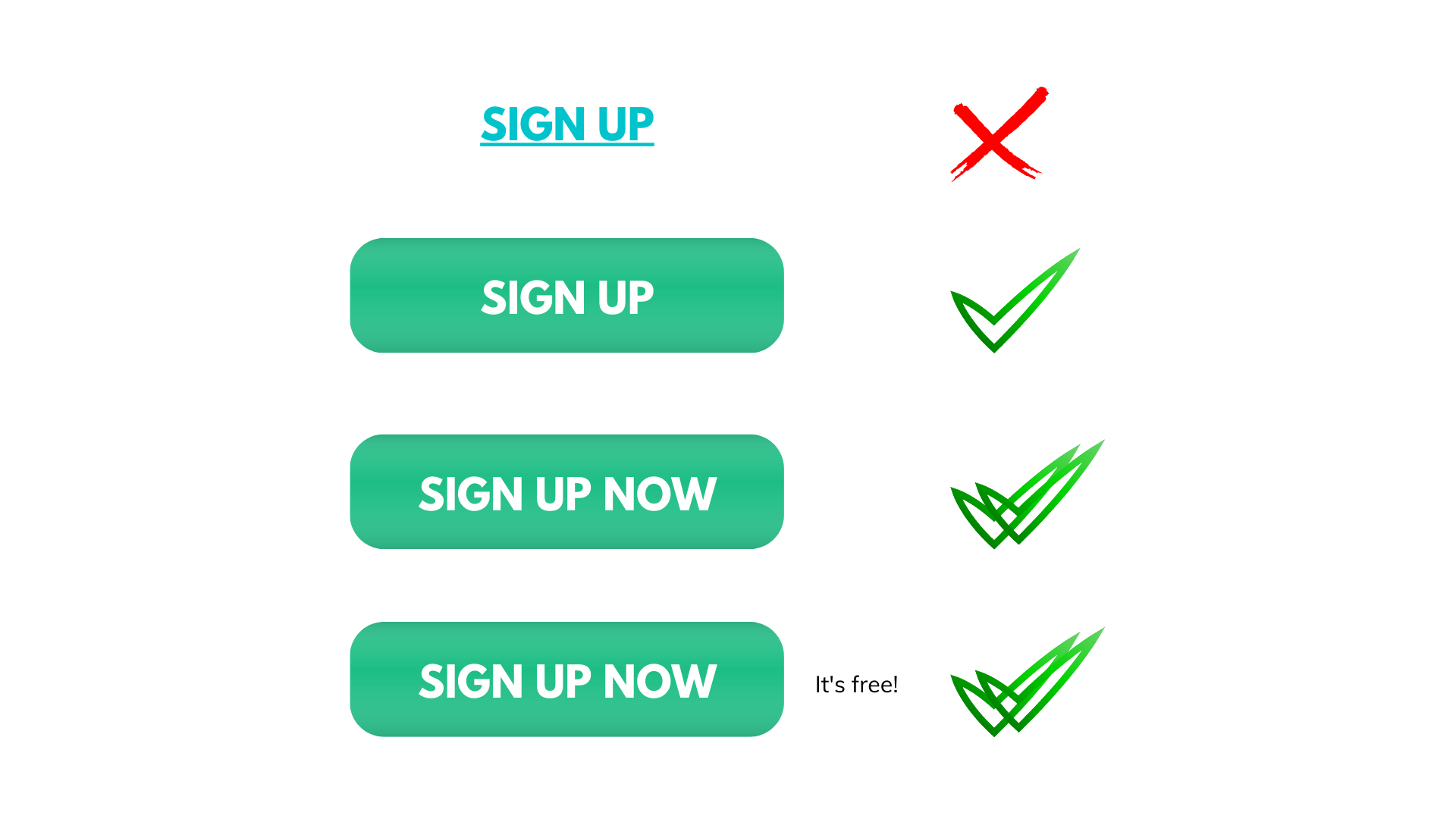
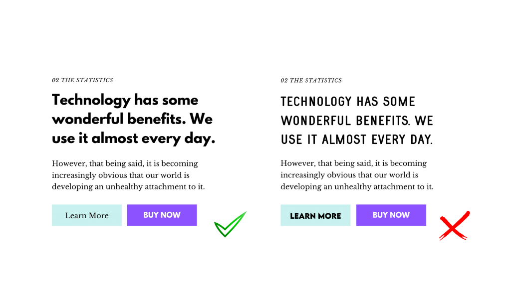
1- Call to Action
A call to action is probably the most important thing on every website. But unfortunately, not all businesses use them efficiently.
CTAs are links, buttons, or words with links that you ask your visitors to take some action. It could be checking another page, signing up, filling out a contact form or buying your products. Your website visitors don’t always have a goal in their minds, so it is your responsibility to help them find their way.
The idea is simple. You can’t get anything if you don’t ask for it.
Here are some of the effective ways of using CTA buttons based on user experience principles:
- Create a sense of urgency
- Choose the proper size and colour. Don’t forget that your prior goal is to draw users’ attention
- Apply contrasting colours so that your CTAs can stand out from the other elements
- Use fewer words that catch visitors’ attention quickly
- Use rounded corners rather than sharp corner buttons as they are easier on the eyes
CTAs are important in terms of SEO as well because a high click-through rate makes your site look reputable to search engines.
2- White Space
Just because you have a website doesn’t mean that you have to use every corner of it. Creating a room around each element is easy for the eyes, and allows each of these elements to have their visual focus.
By leaving white space around text, images, or graphics on your website, you allow your visitors to easily understand what you are trying to say. Here are some of the other advantages of using white space on your website:
- It drives attention to the right elements
- Makes your website easy to read
- The website does not feel cluttered
- It adds elegance and professionalism to the website
- It improves the visual hierarchy
Google’s search engine is a great example of this. By using white space on their search page, they help visitors not to get distracted by anything else. The white space directs the eye right to the search bar.
Remember – When it comes to web design, less is more.
3- Simple Navigation
Have you ever encountered a situation, where you visit a website and want to perform a task, but you are completely lost not knowing where to go? As mentioned above, it is your responsibility to help direct your visitors to the actions you want them to take. Otherwise, they leave and go to the competitor’s website.
Even though we may not realize it, we are impatient, especially in today’s digital world. We don’t want to spend minutes searching for something on a website. Plus there is always another website which allows us to find our way easily.
Here are the best practices to make your navigation simpler for your potential clients:
- Avoid using tiny menus (or menu icons) on large screens
- Ensure that your menus have enough visual weight
- Make use of left-justified vertical menus so that your menu labels are easy to scan
- Use different navigation for mobile and desktop (make use of hamburger menus for mobile sites)
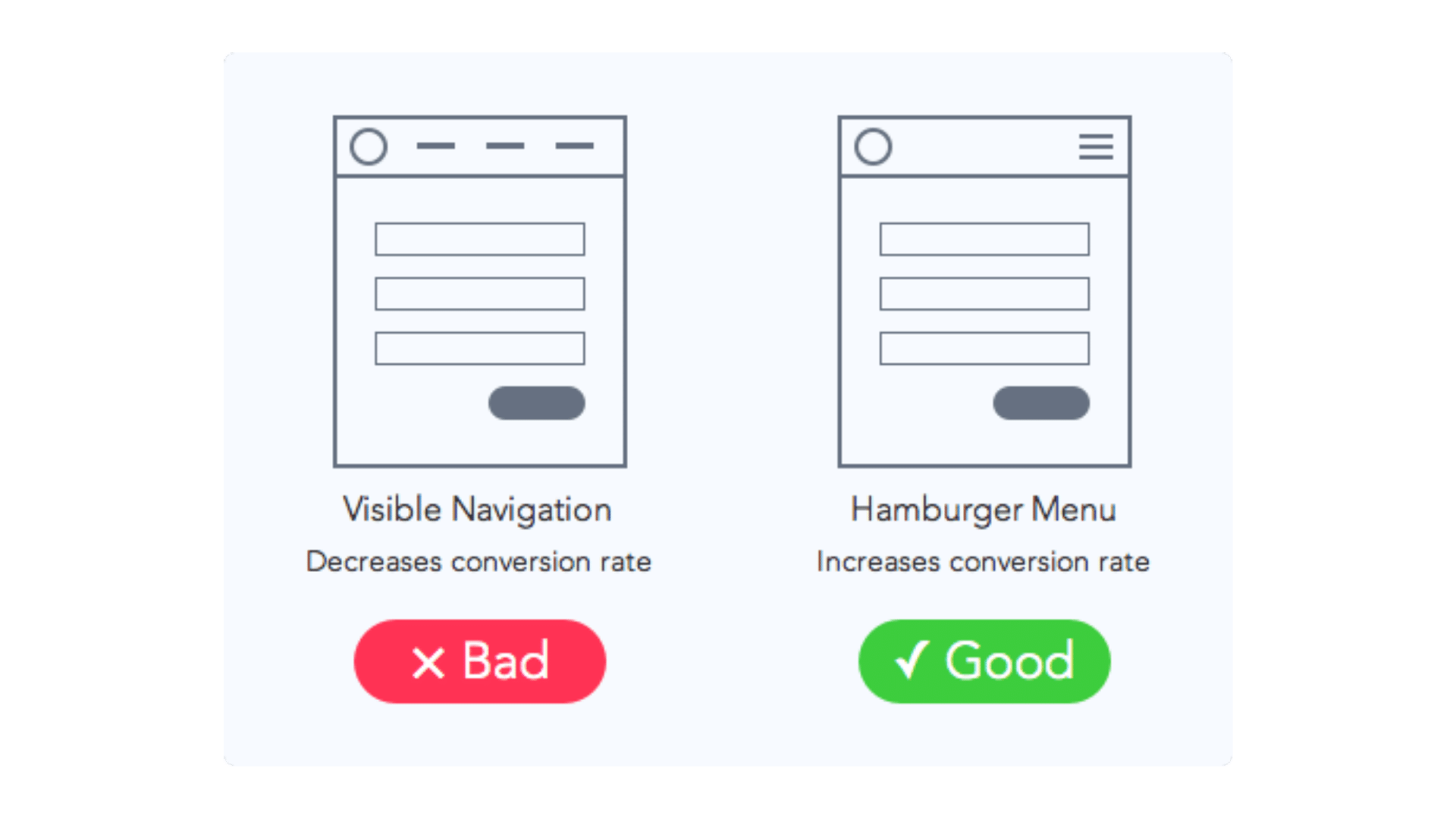
Source: UX movement
4- Visual Design
This naturally covers all of the above but there are certain things you need to know about the visual design elements of your website.
Using a lot of colours, differently sized elements and proportions make your website look cluttered. However, this is not only about your website looking pretty. It is a combination of science and human psychology. When your website is easy to read and visually appealing, it will provoke positive emotions and build user trust and interest.
Here are some UX visual design principles you should be applying on your websites:
- Use no more than 3 different sizes.
- Emphasize the most important aspect by making it the biggest.
- Use 2–3 typeface sizes to indicate what pieces of content are most important.
- Consider using bright colours for important items; muted colours for less important ones
- Establish an imaginary axis on your visual to understand the current state of balance on your visual
- Use a colour-contrast checker to ensure that your content can be read by all your target users
- Use colour and contrast to make objects stand out
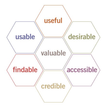
5- User Experience Qualities
Many factors influence the user experience of your website. Peter Morville represents this through his User Experience Honeycomb. For a meaningful and valuable user experience, your content should be:
- Useful: Your content should be original and fulfil a need
- Usable: The site must be easy to use
- Desirable: Image, identity, brand, and other design elements are used to evoke emotion and appreciation
- Findable: Content needs to be navigable and locatable onsite and offsite
- Accessible: Content needs to be accessible to people with disabilities
- Credible: Users must trust and believe what you tell them
If you want a professional website that stands out from the crowds, your web design should always concentrate on the user experience. It is a highly competitive world. And if you want to be successful in this competitive digital environment, you should apply all the principles mentioned above.
Source: usability.gov
We live in a highly competitive digital environment. If you want to establish a successful online existence, you should understand and apply all the design principles mentioned above. Because only a strong visual system builds user trust and interest in the product.
Looking for a website redesign? Contact us and let’s chat!

1 thought on “5 Crucial Elements for a Professional Website Design”
Design elements are indeed so important when it comes to websites. Thanks for sharing!